The long-running joke online is that the “I have read and understood the terms and conditions” declaration is the biggest lie ever told. However, a quick glance at most terms and conditions pages, and it’s no surprise why 99% of people skip them.
These pages are severely neglected and often don’t meet the same usability standards as the rest of a business’ app or website. As a result, businesses are missing out on golden opportunities to further improve their users’ experience.
We’re going to explain exactly what terms and conditions pages are for, and why they deserve a bit more attention. We’ll also give you some practical user experience copywriting tips for improving your presentation of any legal content.
In this article:
- What are terms and conditions, and why do we need them?
- Why are terms and conditions important?
- 5 ways to improve your terms and conditions
- Use plain English
- Format your page with the user in mind
- Add functional elements to improve navigation
- Consider using icons and images
- Consider separating your terms and conditions
Why are terms and conditions important?
To understand why terms and conditions are important, we need to start by defining exactly what they’re used for. A policy page is any page that outlines a company’s agreements, policies or terms, such as a terms and conditions page. The purpose of a policy page is to outline the contractual obligations that both the company and customer must abide by in order to provide and use a service. Other examples of policy pages include disclaimers, licensing agreements, privacy policies, and user agreements.
There’s a clear, legal necessity for policy pages. However, there’s no reason why they shouldn’t be considered from a design and usability perspective. In most cases, these terms are written by legal and/or risk teams within companies as a ‘check box’ exercise. They’re then published with very little consideration for the user on the other end of the screen.
Your users should have as good an experience trying to find out how third parties will use their data, as they would when they’re trying to buy your products. Aside from that, here are two more valuable reasons why we need terms and conditions:
They help you build trust with your users
Have you ever read the small print of a product or service, and found shady terms that put you off? Offering your users an unclear policy page may give them the same impression.
Terms and conditions that are clear, easy to navigate, and readable, show your users that your business is transparent. They also helps you to build credibility with your existing and potential customers. If your terms and conditions are complicated and poorly formatted, your users may question whether you value their experience. Worse still, they may think you’re intentionally trying to obscure important information for illicit reasons.
They’re your first (legal) line of defence
From an entirely self-interested perspective, it’s in your business’ best interests to ensure that the terms and conditions page is accessible and understandable. There has been a rise of civil cases against businesses who use deceptive or misleading terms in their policy pages, namely their terms of use pages. In 2016, more than 20 of these lawsuits were raised in New Jersey alone.
The reputational damage of this type of litigation is trouble enough, but you may also be required to pay compensatory damages if you’re found guilty. You can avoid all of this by ensuring that your policy disclosure pages are simple and readable.
5 ways to improve your terms and conditions
Designing a perfectly user-friendly terms and conditions page sounds great in practice, but you may be curious as to how to actually do it. Below are five UX tips that you should consider incorporating into your terms and conditions page. We’ve also included some examples of businesses that either have, or haven’t succeeded in their attempts.
Use plain English
It’s completely understandable if you can’t entirely avoid using legal jargon in your terms. However, readability data shows the average reading age in the UK is nine years old, and in the US, it’s 12-14 years old. Filling your page with “legalese” – formal or technical language – will make it inaccessible to most of your users.
Start by picking out and replacing as many of the legal terms as you can. If the bulk of your terms are still difficult to understand, you can include a translation at the start of each new section, to summarise what the legal language means to the user, in Layman’s terms.
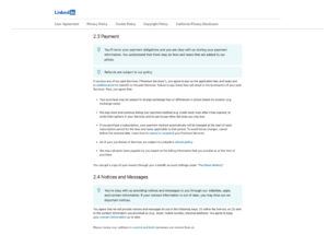
LinkedIn’s User Agreement page provides a clear summary at the start of each section, followed by the standard “legalese” version. (Source: LinkedIn)
Format your page with the user in mind
This is arguably one of the most important, and easiest, things you can do to improve the readability of your policy page.
You’ve likely come across a website that has its terms slapped onto a page in a full long block of text. These pages are painful to get through, but also really intimidating. Good text formatting is a fundamental building block in the creation of a user-friendly page. And, with that in mind, there are a few things to consider when you’re creating or updating your terms and conditions content:
- Format your text appropriately: Write your content in sentence case rather than all capitals, WHICH LOOKS LIKE YOU’RE YELLING
- Prioritise spacing: Make sure that there’s enough space between lines of text to avoid causing eye strain to your users
- Keep consistent fonts: The font, and font size, of your terms and conditions should match the rest of your interface. If the rest of your website is written in 14pt, don’t use 8pt to squeeze more onto the page.
- Keep it concise: Avoid long sentences that run over multiple lines – keep them short so they’re easier to digest
- Consider the interface: Make sure that the format of your page is readable on mobile, tablet and desktop. Although the content will be the same across all three, each of these interfaces are different
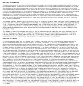
DraftKings’ Terms of Use page includes a section written in capitals, with minimal spacing, which is extremely difficult to read. (Source: DraftKings)
Add functional elements to improve navigation
From a UX perspective, information architecture – the way that content is labelled, organised and structured – is of equal importance to the content itself. This is because it plays a role in how the user will feel when they interact with the content. Your policy page is likely only there for practical reasons, but it should still be functional, so its intended audience can easily find what they’re looking for. Ultimately, making small architectural changes will have a positive impact on your user’s experience.
Consider these tips:
- Include a table of contents so that users can jump to the sections that are most relevant to them
- The default approach to a terms and conditions page is to title and explain each section. Consider whether using an alternative format (such as an FAQ-style layout) is better suited to your audience.
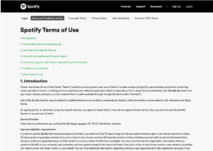
Spotify includes a table of contents at the top of its Terms of Use page. This is a really helpful addition for users who want to skip to the information that’s relevant to them. (Source: Spotify)
Consider using icons and images
Just because it’s a policy disclosure page, doesn’t mean it can’t be fun, right? Your terms and conditions don’t have to be monotonous. But, more importantly, large blocks of uninterrupted text can be difficult for users with reading and visual disabilities. Consider using icons or images to separate each section of your terms – it’ll make them more visually appealing and welcoming.
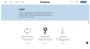
Mailchip uses playful imagery to make its legal policies look more inviting. (Source: Mailchimp)
Consider separating your terms and conditions
Your easiest option is to keep all your terms and conditions in one place, on a page that’s relatively hidden from public view. However, that’s not necessarily the best option for your users.
If some of your terms relate to a specific product, or part of your service offering, it may be more helpful and transparent to display them when the user is trying to complete the relevant action, or interact with that specific product. An analogy for this is you wouldn’t put the ingredient information of Heinz’ products on the back of its Tomato Ketchup – each product lists its own “terms”.
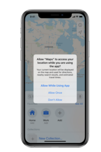
Apple’s iPhones ask for certain permissions from its users when they interact with a relevant app, rather than asking for blanket permission when you agree to its initial terms and conditions. (Source: Apple)
Conclusion
Designing clear and concise terms and conditions is no exact science, and the examples show that businesses take varying approaches to meet their users’ needs. The main takeaway is that there’s a lot of potential to delight (and surprise) your users by giving your policy pages more consideration. It would be unreasonable to suggest that any business prioritises their terms and conditions over their product pages. But, ensuring that your page is well put-together is one way to stand out in an increasingly crowded market.
And here’s a prediction…
Unusable terms and conditions are going to form the basis of a big consumer affairs scandal, especially in relation to financial products and services. If you remember the payment protection insurance scandal, you’ll know how quickly these things can move and how ruinous they can be regulated businesses.
Why do we think there’s a scandal looming?
Way back in 2014, the Financial Conduct Authority started warning companies about ‘over disclosure’ in their terms and conditions. Over disclosure, according to the FCA, is essentially a layering of terms and conditions upon more terms and conditions in order to protect the business, not to help the customer. Most terms and conditions in their current form, are too long and verbose to be useful. And it is obvious that this is a deliberate tactic used to protect business from litigation. In a nutshell, instead of making terms and conditions clear and easy to use, businesses use them as a ‘disclaimer dumping ground’. Any faults or potential failures on their part are covered in their terms and conditions.
At the time of writing this post, it’s been 9 years since the FCA first started sounding the alarm bells. And from what we’ve seen doing UX and content design work for brands in regulated sectors, nothing has changed. Only Monzo has addressed the issue of over disclosure in its terms and conditions.
Essential Content has been helping regulated businesses create user-friendly, compliant and risk-free terms and conditions for the past two years. If you think your business’ terms and conditions need addressing, get in touch.
